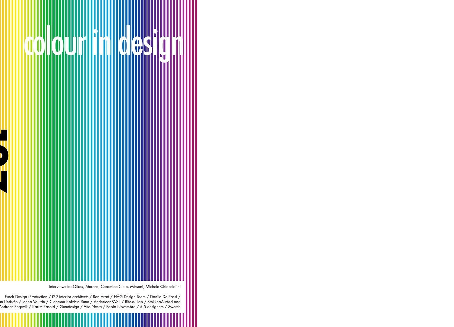
International magazine of architecture and project design april 2013
Colour, or what unites and reveals the distance between warmth and odour.
Any creative act, project, artistic discipline or, more simply, any product of human activities provokes sensations or sentiments that interfere with our senses, stimulating them and rousing us from indifference. Among these, the stimuli caused by colour and perceived through sight are no less important or incisive than the tactile ones conveyed by the texture of bodies, than the possibility to establish a sensible and changeable contact with them on the basis of their temperature, or than our ability to recognize them it suffices to consider food by means of our olfactory sense and thus from their smell. Colour has, if truth be told, always been relegated to a subordinate, accessory and decorative role which is also reflected by common language, where the expression touch of colour is used to indicate something unessential that adds little more than nuances, accents or anecdotes. All this clearly has no real correspondence with reality, with everyday life, with the important role played by colour on our psyche and thus on our conduct it is enough to consider the mood swings that the sight of a grey sky instead of a bright blue horizon is capable of producing -. Such a superficial approach to colour is certainly attributable to the legacy associated with issues, problems and disciplines with which we are unfamiliar and that we know little about. In fact, colour is a quite recent conquest, a result which did not become diffused as part of the contemporary reality until a few years ago; photography was in black and white and art photographers sometimes still refuse a part of the expressiveness, that remains mysteriously concealed, and television did not begin to transmit in colour until the Eighties. All this ingenuity, or perhaps we should rather say backwardness of the debate on the subject should therefore not be all that surprising. It is also important to stress, precisely on a cultural level, the idea that purity coincides with an absence of colour, or in other words with white, while colours which are indeed defined as strong are symbol of extravagance and eccentricity. Grey, on the contrary, stands for sobriety, as it is something intermediate that avoids to take a stand, while black the accumulation of and superimposition of all colours is even funereal, symbol of sadness and thus of bereavement. Nature fortunately cares not a bit about these commonplaces; it renders them small and ridiculous, like human weakness, and so colour, through a generalized and renewed sensibility to the environment, seems to enjoy a revival that is reflected by earth and oxide colours, by intermediate shades and pastels. It may not be a matter of a complete liberation from censorship, but it is at least a sign that things are moving in the right direction.
Marco Casamonti
Download cover and index
Download introduction of Marco Casamonti
Download Interview


